


Problem
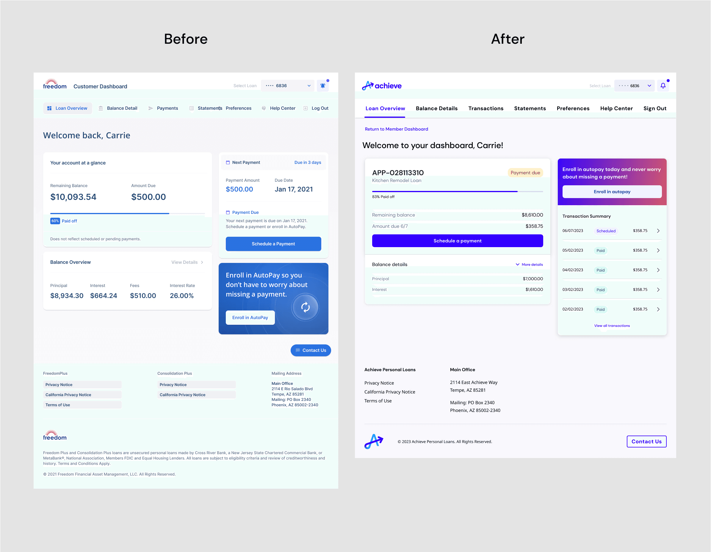
One of the critical areas for transformation was the Personal Loans servicing dashboard, a digital experience with hundreds of screens built using the company's old, outdated brand. The UI needed to be overhauled to reflect the new Achieve aesthetic, but the process was complicated by the absence of documentation or a single source of truth for the existing design.
Goals
Completely redesign the Personal Loans dashboard to reflect Achieve's new brand standards
Discover and implement improvements focusing on the key tasks within the dashboard
Work efficiently to meet the rapidly approaching launch of the new Achieve brand across the rest of the company's public-facing touchpoints.
Process
Step 1: Document and Assess the Current State of the Dashboard
The process began with a thorough examination of the existing Personal Loans dashboard. I conducted a detailed audit, capturing screenshots of every existing screen. To map the existing functionality, I collaborated with team members who had worked on the dashboard in the past. Together we created a series of flow diagrams that visualized all functions of the dashboard. This documentation provided a comprehensive understanding of the dashboard’s capabilities and areas in need of improvement.


Step 2: Discovery Research
Because the Freedom Financial personal loans dashboard had been used to service personal loans for several years prior to the re-brand, we wanted to take stock of its current successes and pain-points. So, we conducted a series of 60-minute discovery session interviews with members of our Personal Loans Sales Department as well as with our Member Services Call Center Team. These discussions surfaced a few interesting areas for improvement:
Our Sales team members spoke of how valuable it is for our members to enroll in autopay. When speaking with applicants, they reported that most appreciated the convenience of automatic payments, but didn't always opt to enroll during the application phase.

A Roadblock for Discovery Research
An important aspect of our discovery work was to gain insights about the current dashboard experience from our real current customers. Unfortunately, user research was still a relatively new function to the company, and our legal and compliance partners had yet to establish policies for recruitment, privacy, and compensation for interviewees. This, combined with our tight timeline, blocked us from speaking with real customers as part of our discovery.
What did we do?
Despite being unable to interview our customers, we still had access to important customer feedback. So in partnership with our UX Researcher, we audited numerous member service call recordings, hundreds of written emails, and many session recordings captured by Hotjar to identify common pain points. This, in addition to our interviews with internal team members, gave us what we needed to identify improvements to prioritize for the dashboard.
Step 3: Ruthless Prioritization
With the launch of the Achieve brand quickly approaching, the team and I chose to prioritize smaller improvements we could make to the dashboard experience quickly. This way, we'd be able to include some of the lowest effort (but most impactful) improvements alongside the total UI overhaul. Some of these improvements included…
Simplifying how we communicate when payments are due
Clarifying how to add payment methods
Enabling users to edit previously scheduled payments on their own (rather than relying on calling Member Services to make changes for them)
Step 4: Establishing a New Source of Truth in Figma
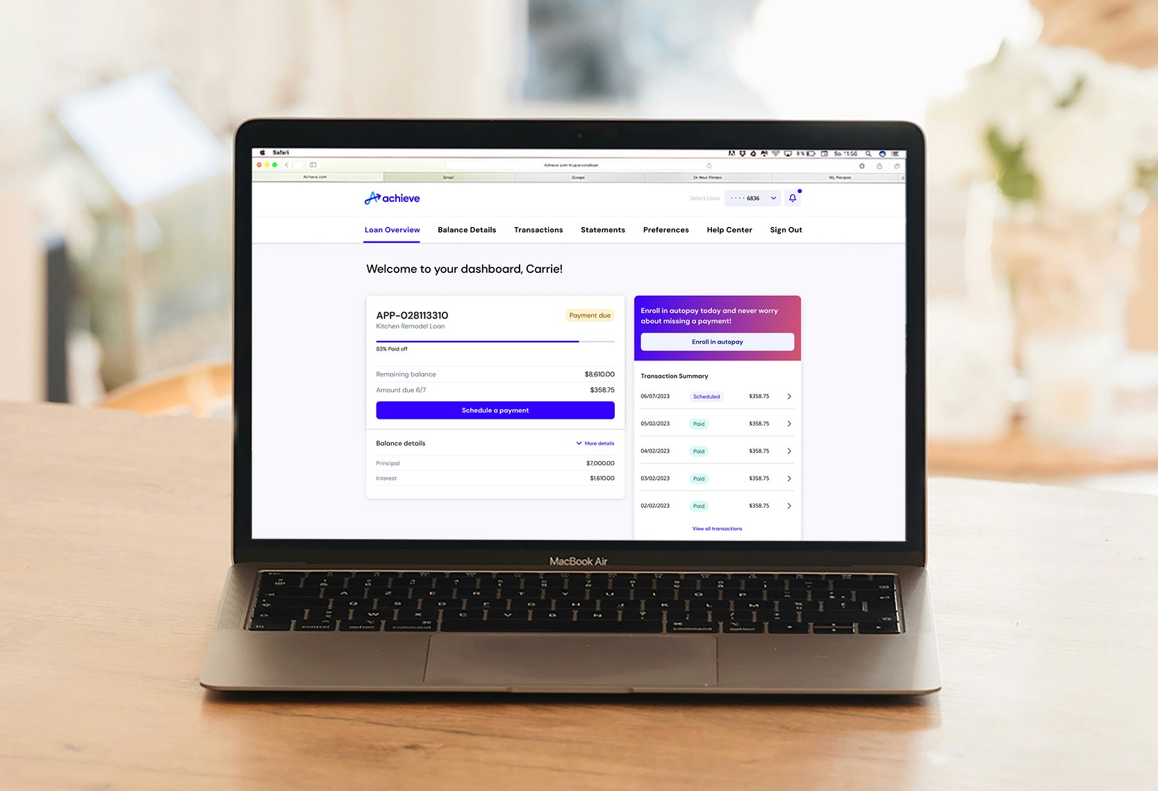
Except for the experience improvements mentioned previously, the majority of the dashboard experience needed to be "re-skinned" to utilize Achieve's new design system components and brand standards. Using the audit and newly created flow maps as a guide, I built a new Figma file from the ground up to serve as the single source of truth for the newly rebranded dashboard. Every screen was meticulously rebuilt, encompassing all user flows with mobile and responsive web breakpoints in mind. This file ensured consistency and clarity across design and development as the project moved into implementation.


Step 5: Implementation
In collaboration with product managers and engineers, we divided the dashboard into prioritized sections for design finalization and development. Frequent stakeholder reviews ensured alignment and provided a forum to collect feedback. Because the engineering team was also new to the company, there were no existing processes to ensure the accuracy of development to final design files—so I spearheaded the creation of the design-UAT process. This included meticulous verification of all design elements—colors, typography, spacing, and copy—to see if they were implemented correctly. I worked directly with engineers to resolve any issues, ensuring a high-quality final product.
Step 6: Launch
The redesigned Personal Loans dashboard launched in November 2022 alongside Achieve’s public debut, marking a seamless transition to the company’s new brand identity.


How did we do?
After the successful launch of the Achieve Personal Loans dashboard, we began tracking its performance—specifically, the user experience improvements we made. After 6 months of the new dashboard's launch, we were happy to report…
The improvements we made to simplifying communication about when payments are due resulted in a ~42% reduction of incoming calls to our member services team.
The work we did to simplify adding payment methods reduced user dropoff by 10%
Simple UI enhancements contributed to a 16% increase in autopay enrollment